83%
Polled users browse social networks online the most often followed by news at 67%.
Design |Prototype | Website
UX Process | UI Design | Branding | Development
Adobe Illustrator, Photoshop | Sketch | InVision | HTML | CSS
There were many problems to consider when beginning to design the keeparoo website. Users needed to be able to easily store images, save links, and create notes. Keeparoo users also needed to have the ability to collaborate with other users. This application also has to work across different platforms.
Design a web application for users to create notes, keep images and links, and have the ability to share that information with individuals or teams. There will be three different plans available. The differences between the plans will be the amount of pouches, collaborators, and storage that the user will need.
The first step in solving the problem was to do a survey of potential users. A Google docs survey of 21 questions was conducted asking users about the devices they use for browsing and saving content online. The survey also asked about the tools they use most when they’re online and what they like and don’t like about the tools. The age range was between 18 and 54 years. The professions varied from teachers, students, artists, and professional positions.
Polled users browse social networks online the most often followed by news at 67%.
Use their browser to bookmark links or images they want to keep. Other close choices were Pinterest and Facebook.
When asked about note-taking habits, over half keep notes for personal and business reasons.
Polled users browse social networks online the most often followed by news at 67%.
Since there were already some variations of cloudsharing apps out there I did an analysis of three competitors similar to keeparoo to understand the competition. I compared Ember, Readme.io, and Evernote. I compared the dashboard-home page, functionalities, sharing functionalities, and pricing of each application. See my competitive analysis here.
I developed three user personas based on future users of collaborative cloudsharing apps. The common goals of these users were to save time, be organized and to have an app that was easy to use.

"I like new technology and using it to be organized is a plus."

"I would love an easy to learn app for organizing my pictures."

"I like keeping in touch with my family and sharing fun stuff I find on the internet."
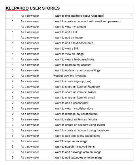
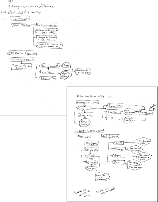
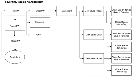
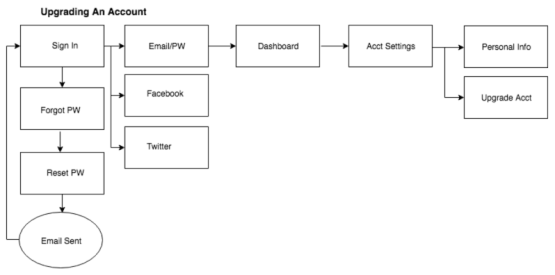
Based on the data gathered from user surveys and personas, I created a number of user stories containing all of the features that new users would love to see feautured in keeparoo. From these stories I sketched out a couple of workflows: one on upgrading an account and the second on favoriting, or tagging, an added item. The workflows were quickly hand sketched then drawn in Draw.io.
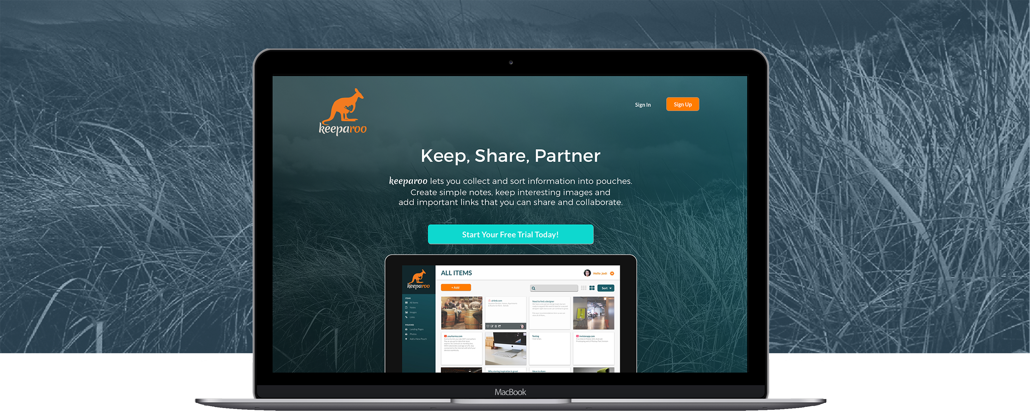
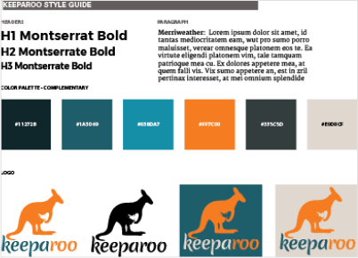
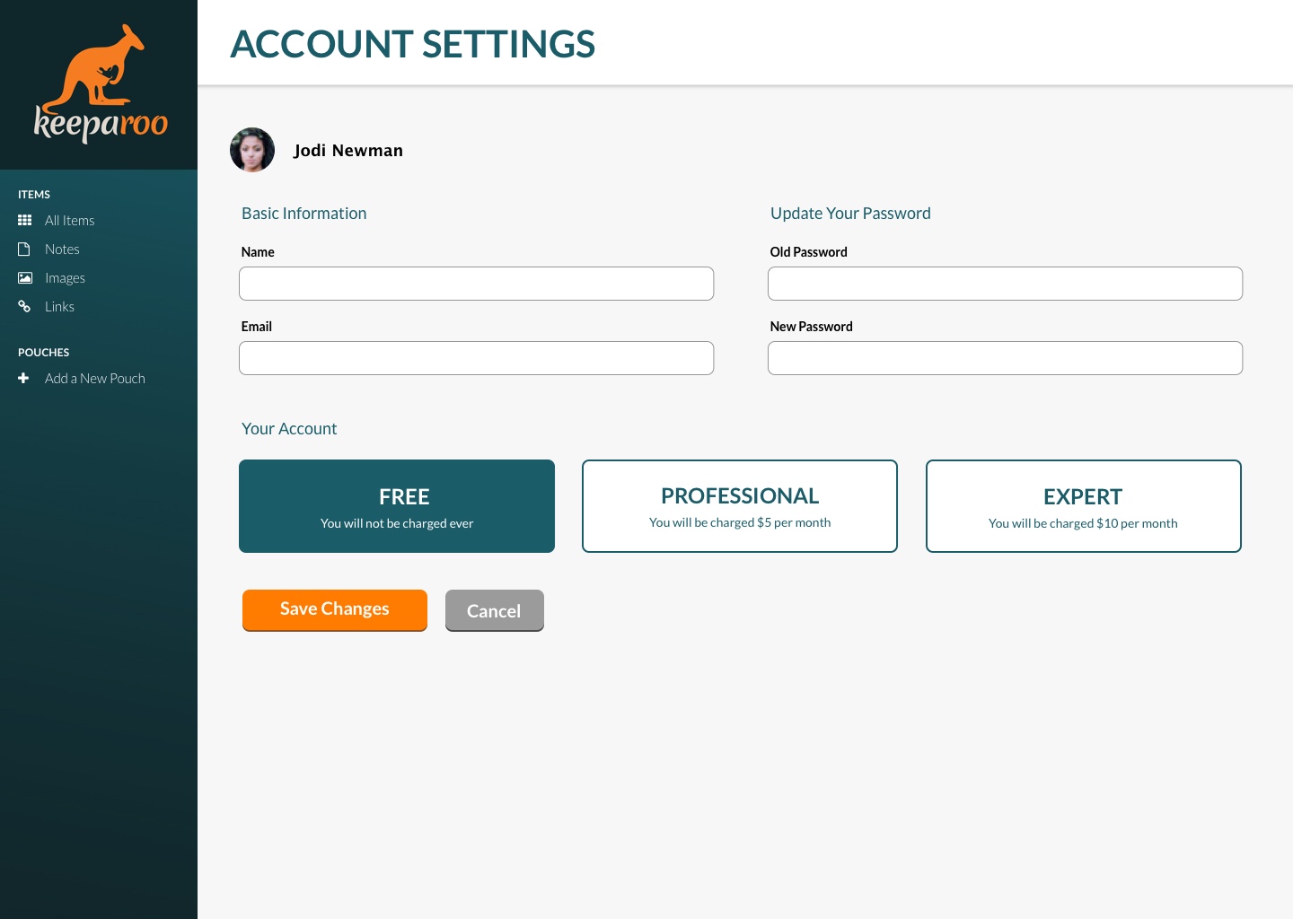
My goals for branding this application was to make sure it had a catchy name and the colors are fresh and contemporary. The name “keeparoo” came from the idea of mother kangaroos keeping their joeys in their pouch for safekeeping. The idea was that users want to keep their images, links, and notes safe too. The logo graphic is a silhouette of a mother kangaroo with a little joey in her pouch. For the main typography and headers, I chose the Montserrat font for its simplicity and serif style. For the subtext, I selected Lato, which is available in most alphabets and has lots of style variations.
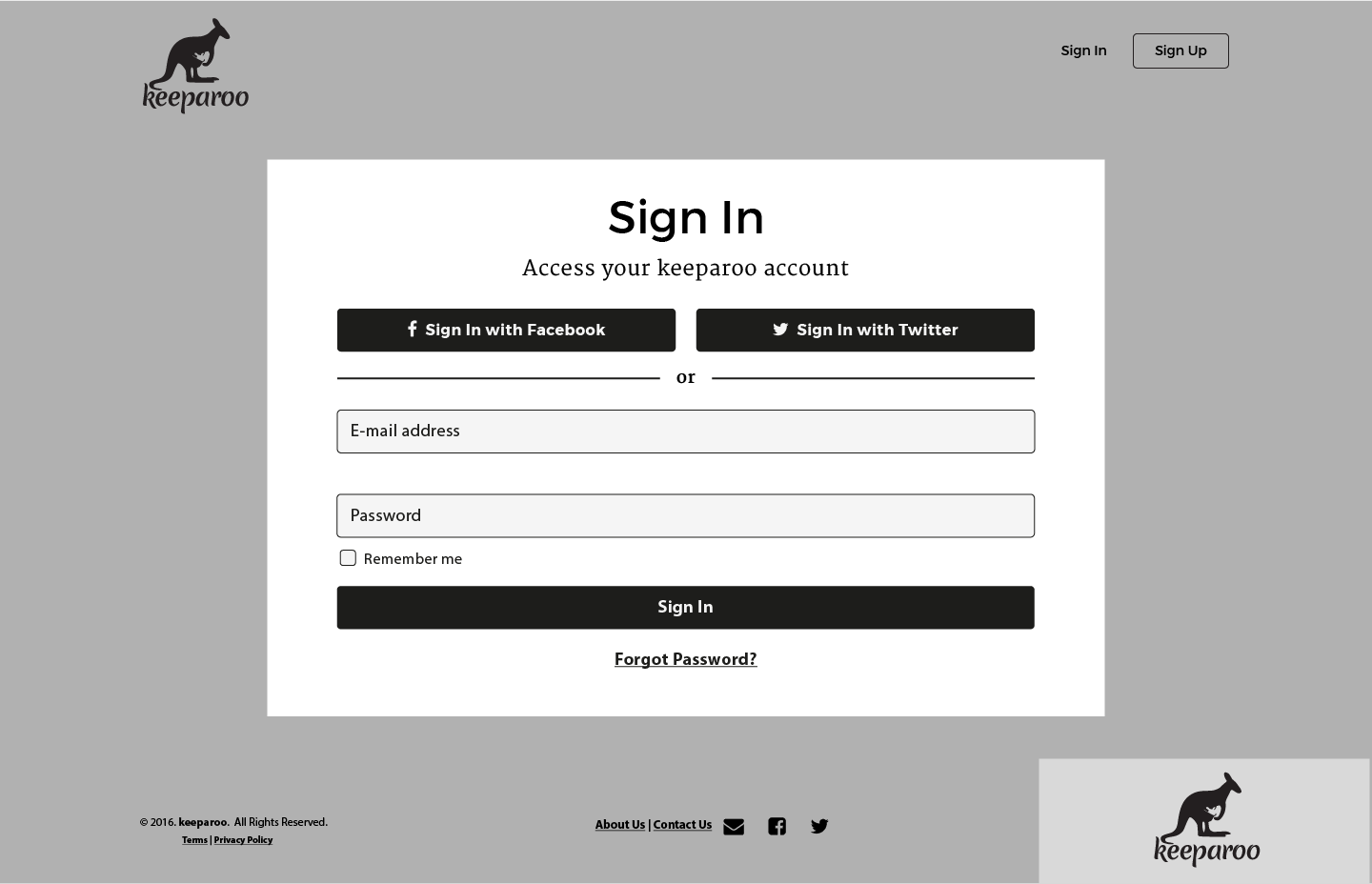
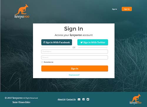
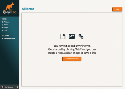
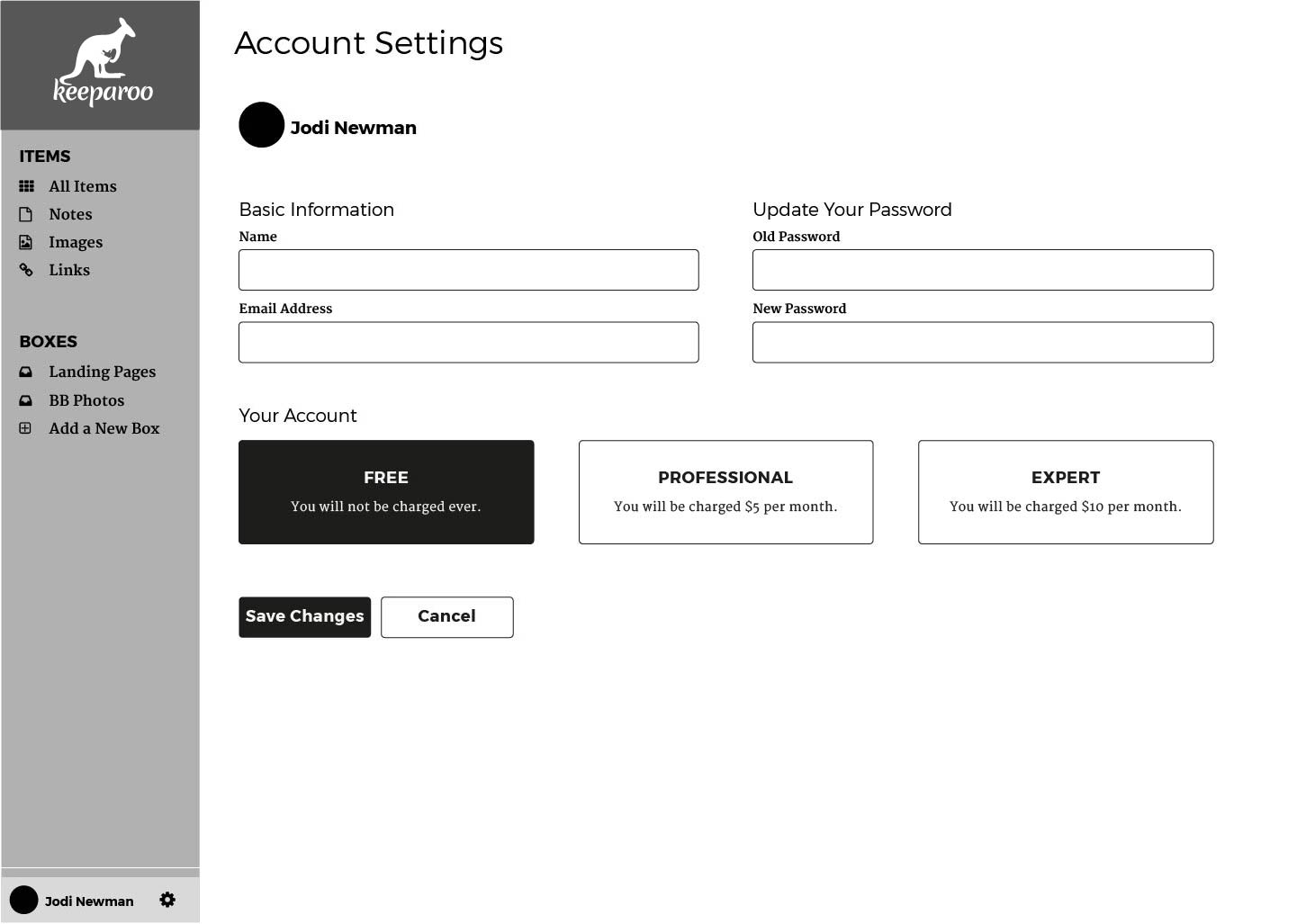
Based on user workflows I next designed high-fidelity wireframes in Illustrator in basic black and white. These wireframes were user tested through a usertesting service that InVision offers. The results from the prototype test is discussed in more detail below. Using the design styling, color palette, and the feedback on the user tested wireframes, I created a series of full-color mockups in Sketch. Below are a few examples of the wireframes along with the finished mockups.
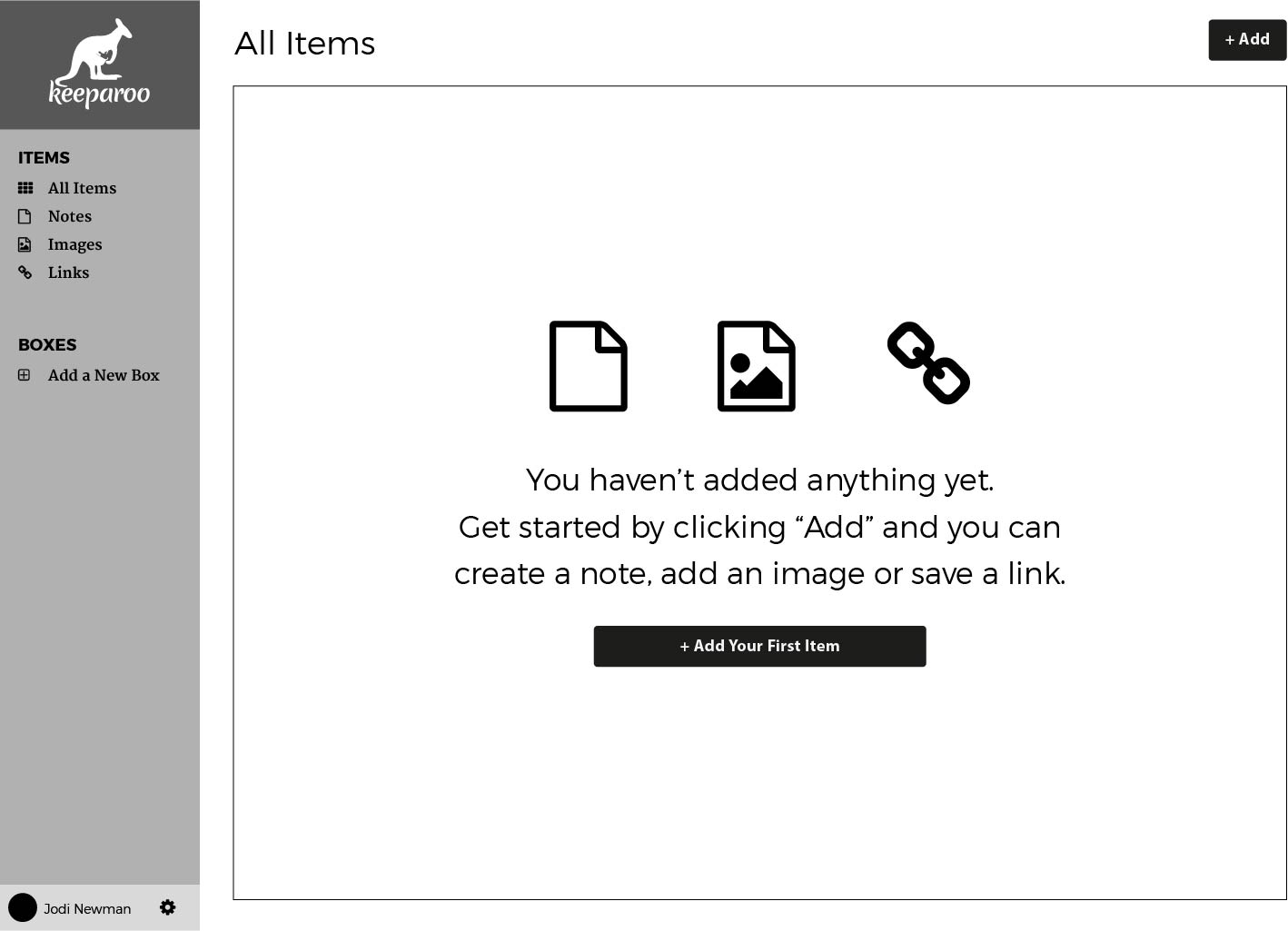
In order to conduct a usability test on the wireframes, I created a prototype using InVision. This prototype was submitted to UserTesting.com through inVision, an online prototyping software, for critique. Upon the results of the first test, I created a second prototype using the mockups created in Illustrator. This allowed the users to view the full-color variations of the site with the fonts and colors I selected. The usability test was conducted by a volunteer user tester and she sent me a video of her session. I learned the tester liked the name keeparoo and guessed that the app was some file-saving service for images like Pinterest. She thought that the prototype would work in a business setting because of the collaboration aspect and the simple design. She said that the design reminded her of a Powerpoint presentation with the boxes looking like slides. She liked the simple design but wondered how projects would work and how limiting the sharing would be. She also was concerned with the sizes of the photos/images and if the boxes were large enough to view them. Based on these results, I opted to keep the name keeparoo, and incorporate some changes based on her feedback to the overall design. Overall I felt that it was good feedback.
The next step after the final user testing was to code out the full-color mockups in HTML and CSS. I used Atom to code and Chrome for testing that code. Since this was my first real coding project, it was fun but challenging. The most challenging process was converting my design that was done in mostly Illustrator. I had to think about how grids and containers worked within a webpage plus make sure it was responsive when the screen size was changed from a desktop, tablet, or mobile screen. It was also great to learn new software programs like Github, Sublime, Atom, and even the inspector tool in Chrome. Something I would change for this first HTML/CSS project was to make my design in Sketch simpler for coding purposes. This project made me realize how much more I have to learn about front-end development. I look forward to practicing coding in my future projects and know that it’ll get easier.
I feel that this project was successful in its design and ideas for an all-in-one application for users in a business or personal setting. The parts of the project that worked for me is the design itself because it is simple and the colors are soothing. I’m happy with the name, keeparoo, because I was able to make it my own and have fun with the design, while making it friendly and engaging for the user. What I thought didn’t work were the sizes of the sample pictures and files within the dashboard. I think I could increase the size of them, or stack them, to make it slightly more organized. Also the sidebar could have more options geared toward project organization. Since this was my first major UI/UX project from start to finish, I learned a lot during the process. It was very challenging and rewarding to see keeparoo come to “life.”